
A progress bar can be used to show how much progress has been made, how much percentage of a goal has been met, satisfaction rates, and many other use cases. Kadence Blocks v3.1 introduced the Kadence Progress Bar Block. You can use this block to display the progress in a visual format.
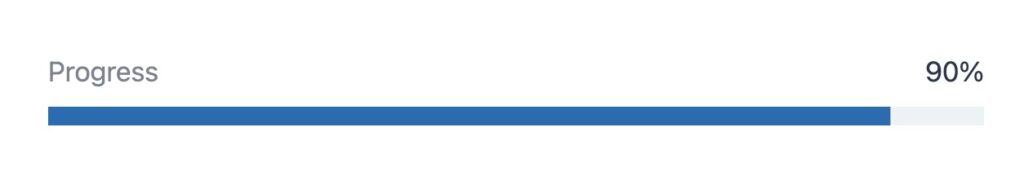
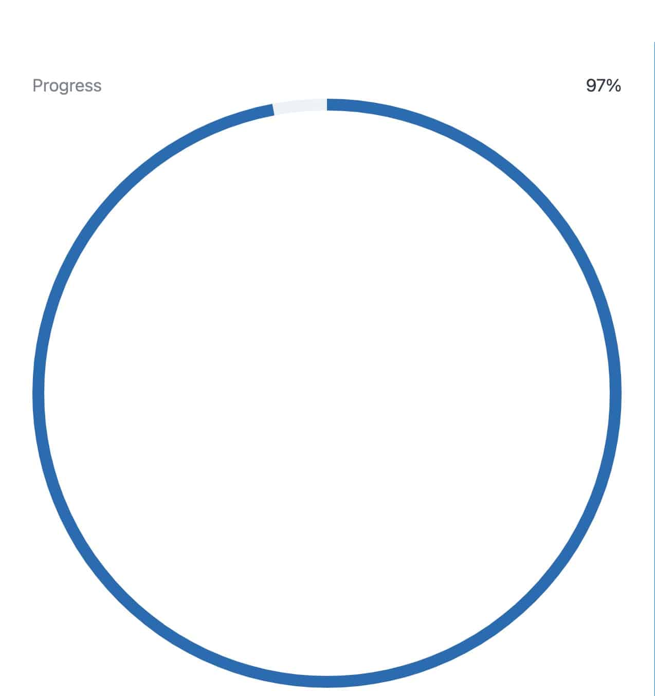
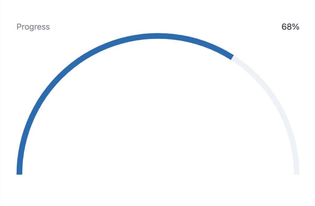
Example Progress Bars
Block Settings
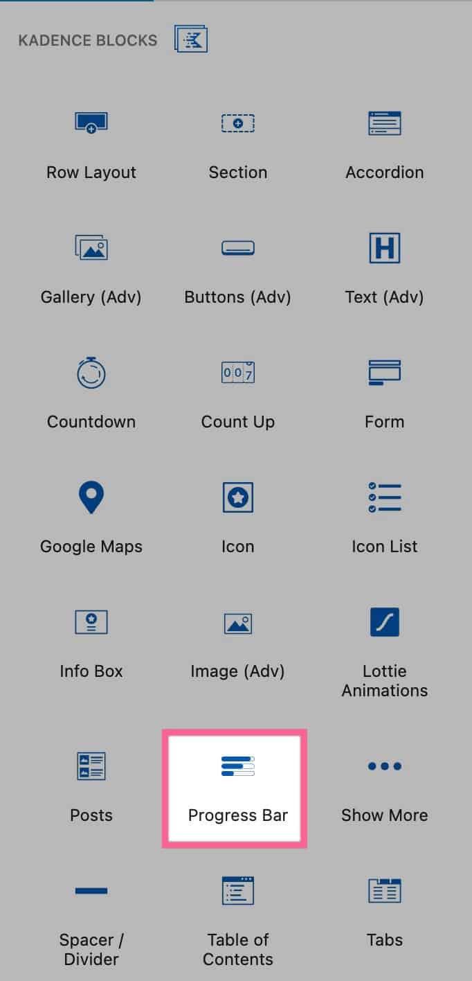
You can add a Progress Bar to the Page by finding the Progress Bar Block.
You can then customize your Progress Bar by using the Block Settings.
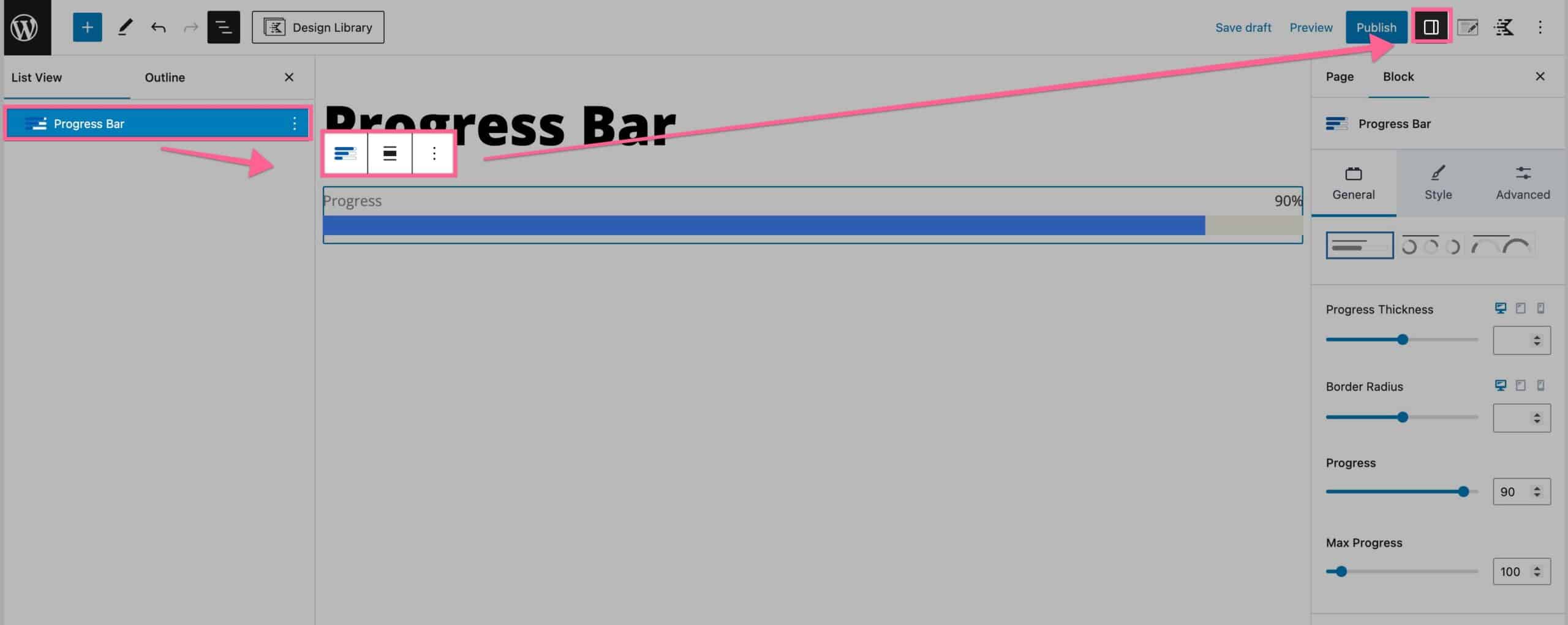
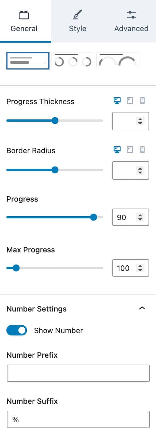
General Tab
At the top of the General Tab, you will see three different layouts that you can choose from. Each layout looks different and can be used in different scenarios.
The Progress Thickness option allows you to adjust the thickness of your Progress Bar.
You can adjust the Border Radius of your Progress Bar using the Border Radius setting.
You can change the Progress Bar percentage using the Progress Block Setting. For example 90/100. This setting would be the 90.
You can also change the Max Progress. This changes the total percent used on your progress bar. For example 90/100. This setting would be the 100.
The Number Settings allow you to show or hide the Progress Bar Number.
You can use the Number Prefix setting to add a prefix to the number shown on the Progress Bar.
Similiarly, you can use the Number Suffix setting to add a suffix to the number shown on the Progress Bar.
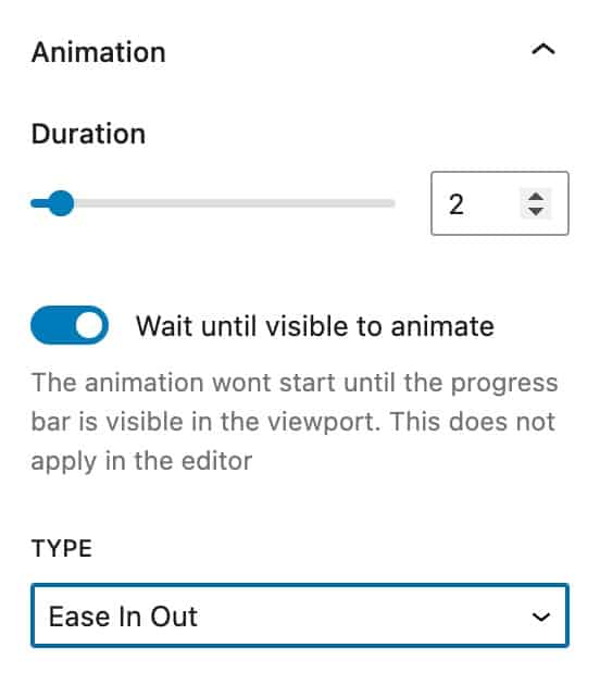
The Animation settings allow you to set an animation on your Progress Bar.
You can set a Duration for the animation.
You can also enable or disable the option to Wait until visible to animate. This option, when enabled, makes the animation start whenever the Progress Bar becomes visible in the viewport.
The Type setting allows you to select your animation type. You can choose from linear, ease in, ease out, or ease in out.
Style Tab
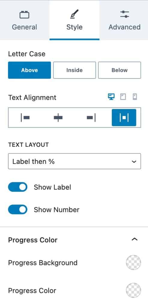
You can use the Letter Case setting to put the “Progress” text above, inside, or below the Progress Bar.
You can also set the Text Alignment for desktop, tablet, and mobile devices.
The Text Layout lets you select the layout your text uses. You can choose either Label then %, % then Label, Label above %, or Label below %.
You can also choose whether to Show the Label or Show the Number using the toggle Show settings.
The Progress Color setting allows you to set a Progress Color and a Progress Background Color.
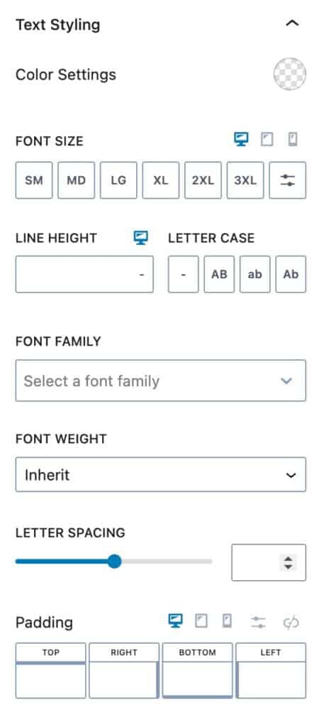
The Text Styling settings allow you to style your text.
You can set a Text Color using the Color Settings setting.
You can adjust the Font Size for desktop, tablet, and mobile devices.
You can change the Line Height and the Lettercase for your Progress Bar.
The Font Family setting allows you to set a Font to the text on your Progress Bar.
You can also set a Font Weight for your Progress Bar.
The Letter Spacing setting allows you to adjust the Progress Bar text spacing.
You can also add a padding around your Progress Bar for desktop, tablet, and mobile devices.
The Number Styling settings allow you to style your Progress Bar Numbers.
Similarly to Text Styling, you can adjust the same settings for Number Styling. These settings will, however, apply to the Numbers instead of the text.
Advanced Tab
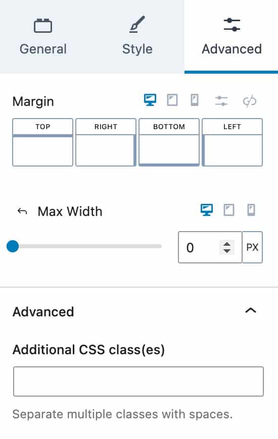
The Advanced Block Settings allow you to add a Margin to your Progress Bar.
You can also add a Max Width.
If you expand the Advanced tab, you will be able to add Additional CSS Class(es) to your Progress Bar Block.
